P9: Portfolio

Alex Cotton Design Portfolio by Alex Cotton

  1. Project Corrections / Time spent:
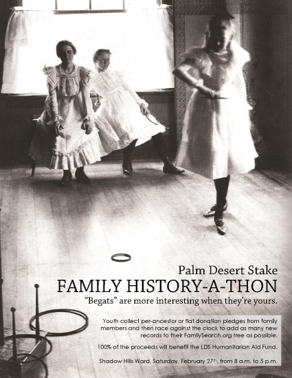
    1. Adjusted the brightness and contrast in the background image of the Flier Project. – 25 min
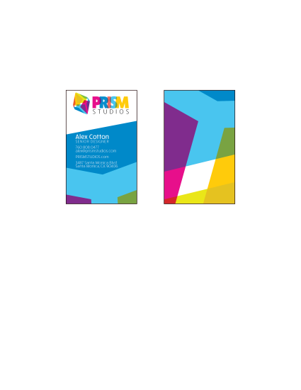
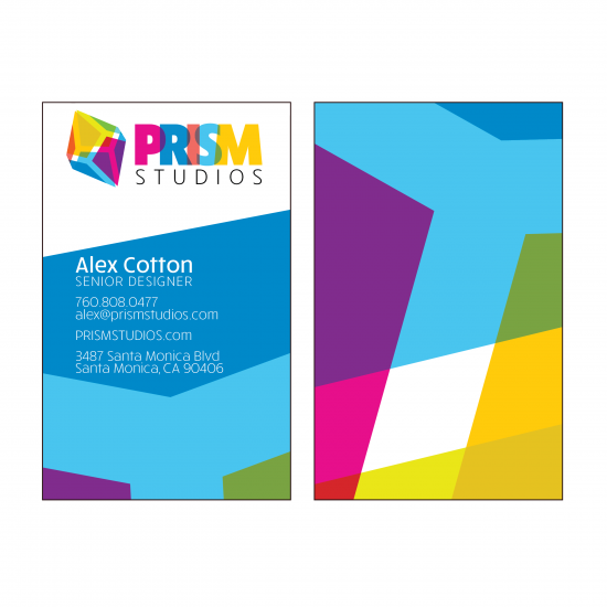
    2. Adjusted the layout of the Business card front and back to give more space for the contact information. – 20 min
    3. Adjusted the mask around the image of Christ to tighten the glow and strengthen His contrast. I also moved His placement to make Him feel bigger and more centered. – 40 min
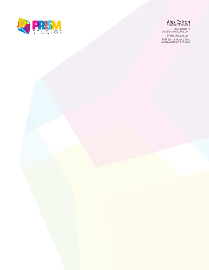
    4. Adjusted the font color of the contact info on the stationary to be more colorful and to match the look and feel of the logo. – 20 min
    5. Adjusted the background of the stationary because it wasn’t quite transparent enough. – 15 min
  2. Message:
    The message of my brochure is an overview of the projects I completed for this class in a bright and happy feeling presentation.
  3. Audience:
    The audience for this portfolio is anyone I might like to have see some examples of my design work. Possibly a company I’ll intern with as a part of my degree program later in my schooling.
  4. Top Thing Learned:
    I had only been introduced to InDesign Master Pages once before, but now I feel like I have a working understanding of them. I have realized how powerful they can be to solidify the look of a design and they instantly enhance the professionalism of a project.
  5. Future application of Visual Media:
    I currently use visual media almost everyday in my job, but my plans are to open my own photography and web design business. I’ll be a one stop shop for businesses to get a website, photos of their products, and a social media and SEO maintenance contract.
  6. Color scheme and color names:
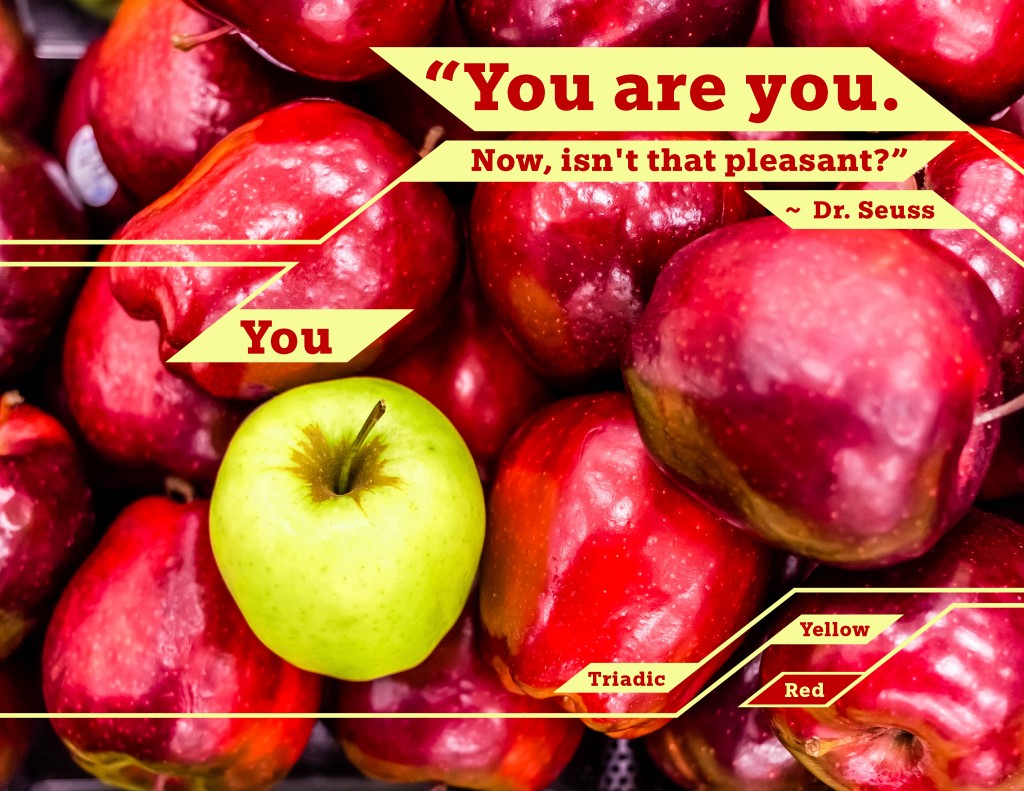
    I used a mixture of Compound and Triad color schemes to create the look I was going for.The colors are:

    1. Purple – #84698a
    2. Pink – #d57197
    3. Green – #a2c6b8
    4. Dark Blue – #404d6f
    5. Red – #d46d71
    6. Yellow – #ede9a0
  7. Title Font Name & Category: Fira Sands – Sans-Serif
  8. Copy Font Name & Category: Fira Sands – Sans-Serif
    I chose to use only one typeface because of how clean and simple it is. I looked at several different options for a serif typeface to use for my body copy but I wasn’t able to find one that looked right for this project.

P8: Brochure

Screen Shot 2016-03-26 at 10.59.33 PMScreen Shot 2016-03-26 at 11.00.01 PMScreen Shot 2016-03-26 at 10.56.52 PM

  1. Description:
    5.25in x 5.25in (when closed) vertical trifold brochure for an iOS app called Hiker’s Harvest.
  2. Process (Programs, Tools, Skills):
    I wanted to make sure the finished product would be large enough for the text to be legible without pushing everything else off of the page, but I also wanted it to be able to be printed on a single page. I set up the InDesign document to 5.25in x 15.75in so it would easily fit on a 11×17 sheet of paper. To keep from wasting time, I used graph paper to create  a smaller version of the brochure to get a solid grasp on how the folding would affect the design. I needed to know where each panel was going to go. I used Illustrator to create the logo, which was build using a 9×9 square grid. I searched for images on unsplash.com; that site is awesome! I made choices about placement and layout to specifically meet the requirements of the assignment.
  3. Message:
    The message is we need to be more considerate of the earth and all of the people on it and stop wasting resources to grow and prepare food that nobody eats.
  4. Audience:
    Hiker’s Harvest is an app for environmentally conscious individuals who are into sustainable food sources and adventure.
  5. Top Thing Learned:
    My big takeaway from this project is Paragraph and Character Styling. I had never used that feature before and I really like how easy it is to use. The best part of it, though, is how you can change your mind and make adjustments to the stylings and they update automatically in your project.
  6. Color scheme and color names:
    I used an Analogous color scheme that spanned the green and yellow spectrums.
  7. Title Font Name & Category:
    Museo – Feels like Serif and Decorative in one
  8. Copy Font Name & Category:
    Clavo – Sans Serif
  9. Word Count of copy:
    271
  10. Thumbnails of Images used:
    OQx70jjBSLOMI5ackhxm_urbex-ppc-030 photo-1427805371062-cacdd21273f1 photo-1452475168325-672188dc4dc3
  11. Sources (Links to images on original websites)
    www.unsplash.com
    I also used a screenshot of San Fran for the maps.

P7: Website

Screen Shot 2016-03-12 at 11.40.01 PM

  1. Description: Webpage for a logo design
  2. Process (Programs, Tools, Skills): You can read a previous post about the logo creation process, however, the website process
  3. Message: Bright and fun
  4. Audience: The intended audience is made up of people and businesses looking for fresh and up-beat designs and other media.
  5. Top Thing Learned: I learned about borders, spacing, and how to assign a class to “<div>’s” for easy formatting in CSS.
  6. Color scheme and color hex(s): light blue – 47C6F0, pink – E70D8A
  7. Title Font Families & Category: Google font: Raleway, sans-serif
  8. Copy Font Families & Category: Google font: Libre Baskerville, serif
  9. Changes made to the CSS: I made lots of CSS changes. I changed border spacing, colors, font size, padding, added fonts, added classes and IDs
  10. Word Count: Not nearly enough.

P6: Stationary

cards and stationary2Large Cards

  1. Description: New logo and stationary for a fictional company.
  2. Process (Programs, Tools, Skills): Prism Studios is the fictional business I created this stationary for. I wanted to do something colorful and fun this week so I just went for it. The logo came together in only a couple hours and the business card and stationary were a cinch after that. I don’t remember what I gave me the idea for the business and logo but once I had it, I popped onto google and looked for cool prisms so I could get a better idea of where to take the project. I studied them for a bit and then saw how the opposite ends mirror each other for most of the examples I found. I quickly sketched half of the prism in illustrator, and then duplicated, flipped, connected, and adjusted the prism’s outlines. I knew I wanted to use lots of color so I pulled bright colors from an image and then adjusted them and found a suitable blending mode to make the colors transparent and blend when stacked. I use a strong type and kept with the same overlapping effect to really sell the design.
  3. Message: The message is that the company is young, fun, and bold.
  4. Audience: The audience is focused toward people and businesses looking for fresh and up-beat designs and other media.
  5. Top Thing Learned: I learned that you can’t change the view in illustrator to only reveal what’s inside the artboard frame. Major bummer! They really need to do something about that.
  6. Color scheme and color names: Okay, I know, I’m the worst at color schemes. I just go with whatever I like and don’t even try to categorize it. I’m the worst. Well, this week isn’t much different. I didn’t even try to design this with a traditional color scheme in mind because I knew I wanted lots of color. I suppose the color scheme could be called “Bright!”, “Happy!”, or “All Up In Your Face!”. Something like that would work.  Maybe Big Split Complementary and Tetradic fell in love, were sealed in the Temple, and 10 months later this happy little color scheme was born.
  7. Title Font Name & Category: Rucksack Black – Sans Serif
  8. Copy Font Name & Category: Rucksack – Medium and Light – Sans Serif

P5: Logos

Morris and Kameron-03

Description: Logo Project

  1. Process (Programs, Tools, Skills, FOCUS principles): I decided, right away, that I wanted to stay as far away from anything cliché as possible. The logo would be for a law practice and it would NOT include a gavel or scales of justice. I decided to use the first letter of each of the partner’s names, and make it look strong and sturdy. I also wanted it to be a little abstract. I broke down the M and the K into their most basic parts and then began shaping them until they looked more like and M and K.
  2. Message: The message is strength, aligned.
  3. Audience: Anyone needing an attorney?
  4. Color scheme and color names: Bold deep red.
  5. Top Thing Learned: I learned how to use Illustrator’s Distort tool much better.
  6. Title Font Name & Category: Century Gothic – Sans Serif

P4: Montage Project

P4 Montage Project
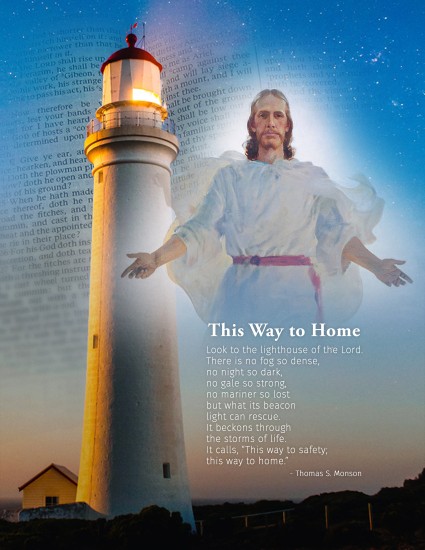
Description: Montage Project

  1. Process (Programs, Tools, Skills, FOCUS principles): I searched unsplash.com for an image with a good amount of negative space so I’d have plenty of room for the other images. I was also looking for an image with imagery that could be used as a metaphor, somehow. Once I had the background chosen, I searched for a quote containing the word “lighthouse” and “LDS”. Then I found two other images that would also fit with the quote. I used Photoshop for 100% of the editing and blended the images with masking layers.
  2. Message: Just like following a lighthouse through a storm, following the Savior will help you through any problem you might experience.
  3. Audience: Members of The Church of Jesus Christ of Latter Day Saints. I suppose the audience could be anyone, but especially those who would recognize an image of Jesus Christ.
  4. Filter / Colorization used and where it was applied: I duplicated the scripture layer and added a blur to it. Then I adjusted the mask layer to shoe much less of it over the top of it’s original layer.
  5. Color scheme and color names: I used white text. The rest of the project is images.
  6. Top Thing Learned: I learned about free stock photo websites.
  7. Title Font Name & Category: Adobe Garamond Pro – Modern
  8. Copy Font Name & Category: Fira Sans – Slab – Sans Serif
  9. Sources:
    1. Lighthouse: www.unsplash.com
    2. The Second Coming: http://store.lds.org/
    3. Scriptures: https://en.wikipedia.org/wiki/Standard_works

P3: Photo Design Project

P4 - Quote

  1. Description: Photodesign project with an uplifting quote.
  2. Process (Programs, Tools, Skills, FOCUS principles): First I photographed these apples in a Target while shopping with my wife, then I used photoshop to edit the image, adjust the color, and add the text and design elements.
  3. Message: The message is simple, You should be yourself. The photo illustrates this by contrasting a green apple against a group of red apples.
  4. Audience: The audience, if narrowed down to less than everyone, is the youth. Everyone needs to hear this message, but they need to hear it the most.
  5. Color scheme and color names: I went with a Triadic color scheme. I only used two of the three colors because it didn’t work with my design.
  6. Top Thing Learned: I learned I should be using smart objects instead of painting marquee selections.
  7. Title Font Name & Category: Egyptian Slate – Slab
  8. Copy Font Name & Category: Egyptian Slate – Slab – I didn’t feel the need to change the font because there was such little text.


Original image:
Apples----Original

P3: Photodesign Activity: Photography

AlexCotton-01-Light-Outside
Light – 01 – Outside
AlexCotton-02-Light-Inside
Light – 02 – Inside
AlexCotton-01-Foreground in Focus
Focus – 01 – Foreground
AlexCotton-02-Background in Focus
Focus – 01 – Background
AlexCotton-01-Rule of Thirds
Composition 01 – Rule of Thirds
AlexCotton-02-Lead Room
Composition 02 – Lead Room

Photography is my thing! It’s one of my biggest passions. I almost always have my camera with me. I’ve actually been editing a photo job most of the day today.

These photos were fun to take. I like projects like this because it gives me an excuse to get away from the computer and go play outside. I took the sky shot as I walked out of my office after work. I took the focus photos of the plants when I picked my son up from school. I have a 4omm Pancake lens so I opened the aperture, turned down the ISO to 50 (super cool Canon 6D feature) and got really close to exaggerate the difference in depth of field. The Lego people were inside on my desk with a desk lamp for light. The Jenga blocks my daughter, Hazel is about to knock over are on the right third line while she’s on the left. My son, Brigham’s favorite thing to do is ride his bike, so I figured I’d go take him out to get a lead room shot. I wasn’t able to do it today, but I love pushing the limits of lighting. I love extreme angles and lighting conditions.

P3: Event Ad Project

P3AAlexCotton (1)-page-001

  1. Description: Event Flier for a Family History-a-thon to raise money for LDS Humanitarian Aid Fund
  2. Process (Programs, Tools, Skills, FOCUS principles): I used photoshop to scan and save my background image and Word for layout.
  3. Message: The message is simple, there’s a family history event where the money collected will be given to the LDS Humanitarian Aid Fund.
  4. Audience: Members of the stake are the intended audience of the event. Everyone from Grandparents down to youth old enough to search for ancestors online.
  5. Color scheme and color names: I suppose, the event of my flier dictated a black and white theme.
  6. Top Thing Learned: I learned that Microsoft Word is much more usefel than I previously thought.
  7. Title Font Name & Category: Chaparral Pro – Slab
  8. Copy Font Name & Category: Century Gothic – Sans Serif
  9. Scanned images used, sources, original sizes, location of scanner used: The photo was scanned from “A World History of Photography” 3rd Edition, Naomi Rosenblum, pg.405. Clarence H. White. Ring Toss, 1899. Platinum print.

P1: Flier

Alex-Cotton-InDesign-Flier

  1. Description: Black and white flyer for a graduate leadership conference
  2. Process (Programs, Tools, Skills, FOCUS principles): My process began with sketches and then I chose the one I liked most and rebuild it in InDesign. I wanted the photo to fade to white without affecting the talent so I editing the background of the image in Photoshop.
  3. Message: The message is that this conference can offer leadership skills that will give graduates an edge in business.
  4. Audience: My audience is made up of recent graduates who are interested in business and would like to increase workplace leadership skills.
  5. Top Thing Learned: I learned that everything needs to be aligned with something.
  6. Title Font Name & Category: Century Gothic – Sans Serif
  7. Copy Font Name & Category: DilleniaUPC – Serif
  8. Links to images used in this project:
    1. https://byui.brainhoney.com/Frame/Component/CoursePlayer?enrollmentid=44634060&itemid=C7OID
    2. https://byui.brainhoney.com/Frame/Component/CoursePlayer?enrollmentid=44634060&itemid=C7OID