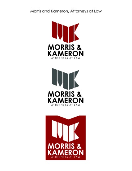
Description: Logo Project
- Process (Programs, Tools, Skills, FOCUS principles): I decided, right away, that I wanted to stay as far away from anything cliché as possible. The logo would be for a law practice and it would NOT include a gavel or scales of justice. I decided to use the first letter of each of the partner’s names, and make it look strong and sturdy. I also wanted it to be a little abstract. I broke down the M and the K into their most basic parts and then began shaping them until they looked more like and M and K.
- Message: The message is strength, aligned.
- Audience: Anyone needing an attorney?
- Color scheme and color names: Bold deep red.
- Top Thing Learned: I learned how to use Illustrator’s Distort tool much better.
- Title Font Name & Category: Century Gothic – Sans Serif
Hey Alex, I really like how you created the design for the “MK.” You gave it a nice 3-D look. Your overall design looks professional and I feel like it get your message across. I think the color you chose was definitely a great choice. Great job on your project!
If you get a chance, you should go check out Barbara’s project:
http://barbaraannewilliams.com/69-2/
I really like this design. I love that you gave it a 3D feel with the angles you chose. Your type looks great as well, I think they not only work with each other but with the feel of the logo you made. The nice deep brick red gives it a sense of authority and power, very effective. Nice job!
Here’s a link to my project if you haven’t seen it already: https://shaymfranklin.wordpress.com/2016/02/21/p5-logos/
Love your final product. I think it has great rhythm and balance. I also love how much character you have packed into such a simple logo.
Mine aren’t as good but if you want to check them out the link is https://wordpress.com/read/post/feed/42219779/934886601