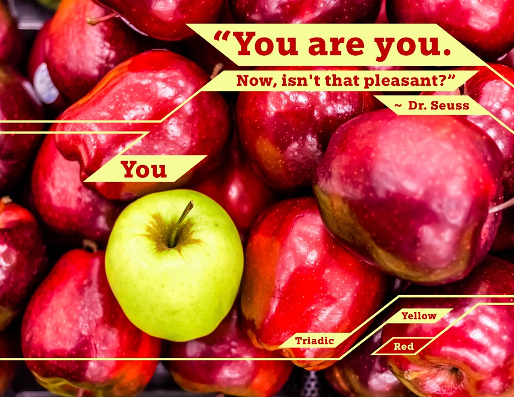
- Description: Photodesign project with an uplifting quote.
- Process (Programs, Tools, Skills, FOCUS principles): First I photographed these apples in a Target while shopping with my wife, then I used photoshop to edit the image, adjust the color, and add the text and design elements.
- Message: The message is simple, You should be yourself. The photo illustrates this by contrasting a green apple against a group of red apples.
- Audience: The audience, if narrowed down to less than everyone, is the youth. Everyone needs to hear this message, but they need to hear it the most.
- Color scheme and color names: I went with a Triadic color scheme. I only used two of the three colors because it didn’t work with my design.
- Top Thing Learned: I learned I should be using smart objects instead of painting marquee selections.
- Title Font Name & Category: Egyptian Slate – Slab
- Copy Font Name & Category: Egyptian Slate – Slab – I didn’t feel the need to change the font because there was such little text.
Original image:
Alex, I really like your design project. The Image is really eye catching, especially with that one apple, so nice crop on that. I also love your color scheme and how well it compliments your image and also adds to the focus with the unique apple. Who knew you could find such solid designs shopping? Great eye.
Take a look at my page if you’re bored or something:
https://com130visualmedia.wordpress.com/2016/02/06/p3-photo-ad/
I like the concept of this as well as the way it looks. The quote is great and I also really like how you labeled the apple that stood out as ‘you.’ The way the texts comes onto the design with the lines add to the design pretty well I think. My design is at https://briglykinsblog.wordpress.com/2016/02/06/p3-photodesign-project/
I think that the structure of this photodesign project is great. you have some great balance, contrast, and incredible image in the background. I love the apple in the middle with the title ‘You’ which is really a cherry on the top of an all around great design.
I feel it would have been interesting to see some more repetition with the design going into the color scheme, but I think that it also looks good. Great job on your photodesign.
Here is the link to my website. https://comm1302016.wordpress.com/2016/02/07/photodesign-project/
The yellow angular lines and parallelograms are exciting. And they almost look like a circuit board.
I note you combined geometric and organic elements. Fiorald Ismaili also did that, and I think you should take a look at his project at the link below:
https://fiorald.wordpress.com/2016/02/06/project-03-photodesign/comment-page-1/#comment-11
Alex – First, I love the photo that you started with. The color is amazing and I love the contrast of the red and green apples. Your choice of using the shapes among the apples was a good one. It draws your attention across the whole of the photo project; plus they are really neat to look at. Your typeface is bold and stands out nicely. The aligning of the shapes, lines, and text works well with the curve of the apples. Great job Alex! Michelle