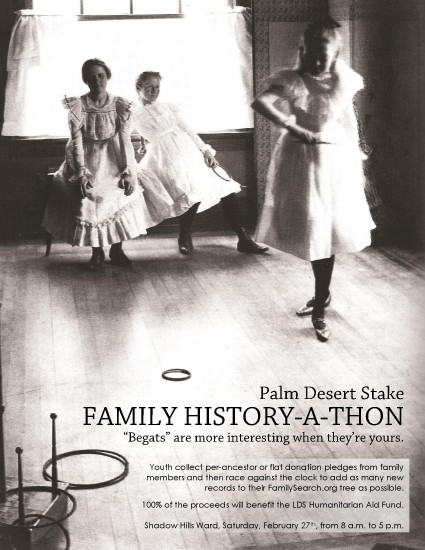
Description: Event Flier for a Family History-a-thon to raise money for LDS Humanitarian Aid Fund
Process (Programs, Tools, Skills, FOCUS principles): I used photoshop to scan and save my background image and Word for layout.
Message: The message is simple, there’s a family history event where the money collected will be given to the LDS Humanitarian Aid Fund.
Audience: Members of the stake are the intended audience of the event. Everyone from Grandparents down to youth old enough to search for ancestors online.
Color scheme and color names: I suppose, the event of my flier dictated a black and white theme.
Top Thing Learned: I learned that Microsoft Word is much more usefel than I previously thought.
Title Font Name & Category: Chaparral Pro – Slab
Copy Font Name & Category: Century Gothic – Sans Serif
Scanned images used, sources, original sizes, location of scanner used: The photo was scanned from “A World History of Photography” 3rd Edition, Naomi Rosenblum, pg.405. Clarence H. White. Ring Toss, 1899. Platinum print.
3 thoughts on “P3: Event Ad Project”
I love everything about this project. The photo is beautiful, the idea you came up is unique, the text says what it needs to without extra fluff, and the overall layout is elegant. I like how the photo is sized to fit the whole page, and provides the background. The photo and the event fit together so well. Really well done.
Oh, and I forgot to say that I love your line “Begats are more interesting when they’re yours.” I showed this to my teenage daughters and it made them laugh.
I had two ideas in my head, one a scouting event and the other a family history event we had coming up. I obviously could not make the family history work, but you absolutely did. You really did an awesome job. I think you chose the perfect image. It allowed you to do so much with the provided space. I thought you did a great job displaying your body copy in that semi transparent text box. Here’s a link to my blog that shows the scout event I had in mind. https://duroncomm130.wordpress.com/2016/01/31/project-2-event-ad/
I love everything about this project. The photo is beautiful, the idea you came up is unique, the text says what it needs to without extra fluff, and the overall layout is elegant. I like how the photo is sized to fit the whole page, and provides the background. The photo and the event fit together so well. Really well done.
Tammy took a very different approach, her photo is small and repeated, and it looks great, too: https://tammydresen.wordpress.com/2016/01/29/project-2-event-ad/
Oh, and I forgot to say that I love your line “Begats are more interesting when they’re yours.” I showed this to my teenage daughters and it made them laugh.
I had two ideas in my head, one a scouting event and the other a family history event we had coming up. I obviously could not make the family history work, but you absolutely did. You really did an awesome job. I think you chose the perfect image. It allowed you to do so much with the provided space. I thought you did a great job displaying your body copy in that semi transparent text box. Here’s a link to my blog that shows the scout event I had in mind. https://duroncomm130.wordpress.com/2016/01/31/project-2-event-ad/