- Description:
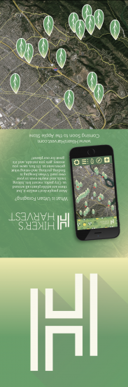
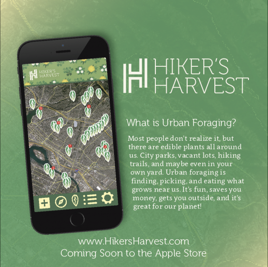
5.25in x 5.25in (when closed) vertical trifold brochure for an iOS app called Hiker’s Harvest. - Process (Programs, Tools, Skills):
I wanted to make sure the finished product would be large enough for the text to be legible without pushing everything else off of the page, but I also wanted it to be able to be printed on a single page. I set up the InDesign document to 5.25in x 15.75in so it would easily fit on a 11×17 sheet of paper. To keep from wasting time, I used graph paper to create a smaller version of the brochure to get a solid grasp on how the folding would affect the design. I needed to know where each panel was going to go. I used Illustrator to create the logo, which was build using a 9×9 square grid. I searched for images on unsplash.com; that site is awesome! I made choices about placement and layout to specifically meet the requirements of the assignment. - Message:
The message is we need to be more considerate of the earth and all of the people on it and stop wasting resources to grow and prepare food that nobody eats. - Audience:
Hiker’s Harvest is an app for environmentally conscious individuals who are into sustainable food sources and adventure. - Top Thing Learned:
My big takeaway from this project is Paragraph and Character Styling. I had never used that feature before and I really like how easy it is to use. The best part of it, though, is how you can change your mind and make adjustments to the stylings and they update automatically in your project. - Color scheme and color names:
I used an Analogous color scheme that spanned the green and yellow spectrums. - Title Font Name & Category:
Museo – Feels like Serif and Decorative in one - Copy Font Name & Category:
Clavo – Sans Serif - Word Count of copy:
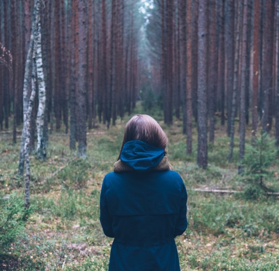
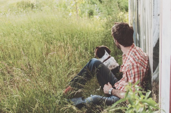
271 - Thumbnails of Images used:
- Sources (Links to images on original websites)
www.unsplash.com
I also used a screenshot of San Fran for the maps.
This is fantastic! I love the colors and the photos. The layout is very clever. I love the font you chose, and the “H” shape. I really like the idea behind this, also, urban foraging is such a great idea.
I’d love your feedback on my design at https://spinningskydesigns.wordpress.com/2016/03/27/project-8-brochure/
Alex – I am really impressed with not only your images and color scheme, but the way the brochure folds. I like how it folds inward and that you created this upside down! Your photos all look very professional and any graphics you have done look spot-on. One of the best details about your brochure is the variations of backgrounds you used on each side of the brochure. While they are different, they all make a cohesive brochure that is both professional and very cool!
My attempt at a brochure is over at https://michellealleygoestoschool.wordpress.com/2016/03/27/project-8-brochure/ – I would love your feedback!