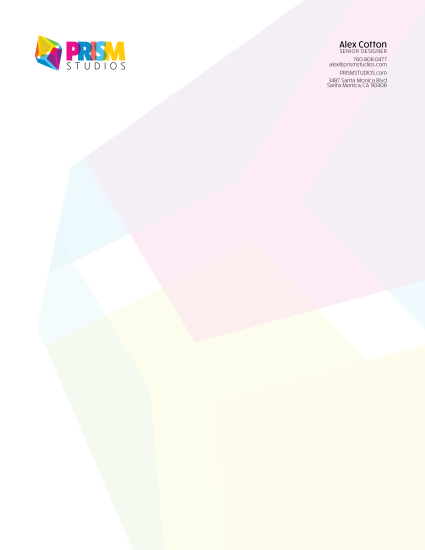
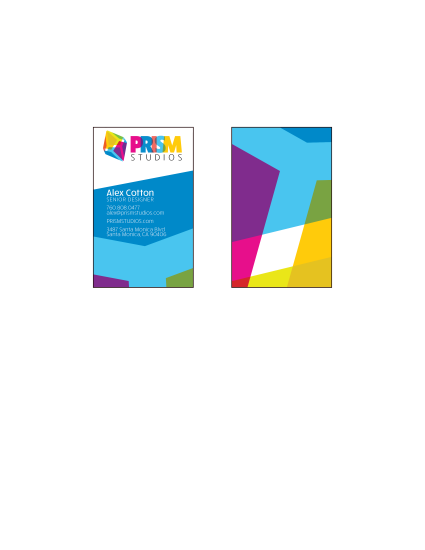
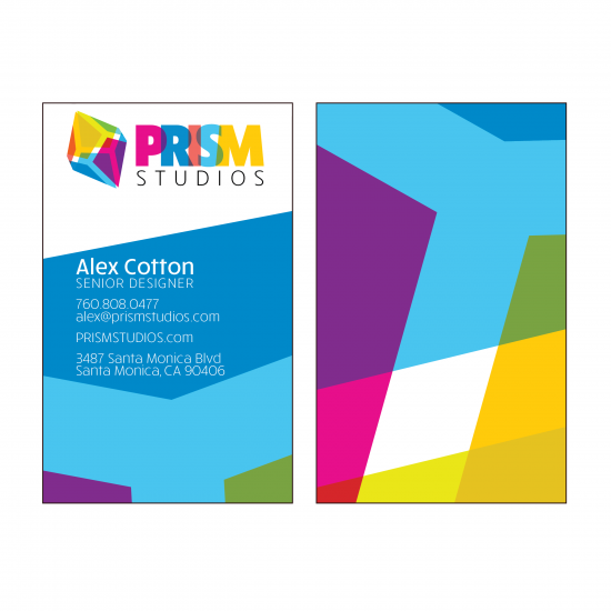
Description: New logo and stationary for a fictional company.
Process (Programs, Tools, Skills): Prism Studios is the fictional business I created this stationary for. I wanted to do something colorful and fun this week so I just went for it. The logo came together in only a couple hours and the business card and stationary were a cinch after that. I don’t remember what I gave me the idea for the business and logo but once I had it, I popped onto google and looked for cool prisms so I could get a better idea of where to take the project. I studied them for a bit and then saw how the opposite ends mirror each other for most of the examples I found. I quickly sketched half of the prism in illustrator, and then duplicated, flipped, connected, and adjusted the prism’s outlines. I knew I wanted to use lots of color so I pulled bright colors from an image and then adjusted them and found a suitable blending mode to make the colors transparent and blend when stacked. I use a strong type and kept with the same overlapping effect to really sell the design.
Message: The message is that the company is young, fun, and bold.
Audience: The audience is focused toward people and businesses looking for fresh and up-beat designs and other media.
Top Thing Learned: I learned that you can’t change the view in illustrator to only reveal what’s inside the artboard frame. Major bummer! They really need to do something about that.
Color scheme and color names: Okay, I know, I’m the worst at color schemes. I just go with whatever I like and don’t even try to categorize it. I’m the worst. Well, this week isn’t much different. I didn’t even try to design this with a traditional color scheme in mind because I knew I wanted lots of color. I suppose the color scheme could be called “Bright!”, “Happy!”, or “All Up In Your Face!”. Something like that would work. Maybe Big Split Complementary and Tetradic fell in love, were sealed in the Temple, and 10 months later this happy little color scheme was born.
Title Font Name & Category: Rucksack Black – Sans Serif
Copy Font Name & Category: Rucksack – Medium and Light – Sans Serif
I love the design of the stationary and that you were able to integrate your logo so well. It looks very good on the actual page. I was curious what inspired that color scheme? It looks good, and it demands attention.
I love this design. You said you had fun working on it and I can tell. It has a really exuberant quality to it. You did a great job with the repetition of the logo and the transparency. I really like the letters overlapping, too. I agree that it would lose some character if you changed it.
Great design. I love the colors. The fun you had is very apparent in the design and the colors. I love the logo and the close up of the log is really good. I had to do a double take to see where it fit into the over all logo.
Check out Cooper’s: https://viscomm130.wordpress.com/2016/02/28/project-6-stationery/
Yeah, I think your urge to do something colorful turned out great! You pulled it off. It’s exciting and loud, but not obnoxious. It fits what you would want for a studio.
Your project looks awesome! I think the logo looks really cool–professional and fun at the same time. The back of the business card looks really interesting and fun. Mine is: https://halllifeblog.wordpress.com/2016/02/28/project-6-stationery/
I love the design of the stationary and that you were able to integrate your logo so well. It looks very good on the actual page. I was curious what inspired that color scheme? It looks good, and it demands attention.
Here is the link to my post. https://comm1302016.wordpress.com/2016/02/28/stationary-project/
I love this design. You said you had fun working on it and I can tell. It has a really exuberant quality to it. You did a great job with the repetition of the logo and the transparency. I really like the letters overlapping, too. I agree that it would lose some character if you changed it.
Great design. I love the colors. The fun you had is very apparent in the design and the colors. I love the logo and the close up of the log is really good. I had to do a double take to see where it fit into the over all logo.
Check out Cooper’s: https://viscomm130.wordpress.com/2016/02/28/project-6-stationery/
Yeah, I think your urge to do something colorful turned out great! You pulled it off. It’s exciting and loud, but not obnoxious. It fits what you would want for a studio.
Check out my stationery at http://www.aaronpulley.net/wpblog/2016/02/comm-130-project-6-stationery/ . It’s for a dentist’s office, so it’s not as exciting as yours, but I think I achieved cute.