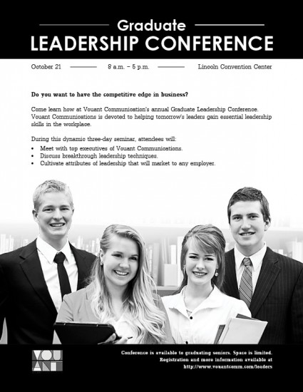
Description: Black and white flyer for a graduate leadership conference
Process (Programs, Tools, Skills, FOCUS principles): My process began with sketches and then I chose the one I liked most and rebuild it in InDesign. I wanted the photo to fade to white without affecting the talent so I editing the background of the image in Photoshop.
Message: The message is that this conference can offer leadership skills that will give graduates an edge in business.
Audience: My audience is made up of recent graduates who are interested in business and would like to increase workplace leadership skills.
Top Thing Learned: I learned that everything needs to be aligned with something.
Title Font Name & Category: Century Gothic – Sans Serif
Alex, that looks amazing! I like how simple your design is. The title looks very elegant, especially with the horizontal lines before and after “Graduate.” Well done!
You’ve got some great contrast in your design. You had a great idea fading out the background into the white space. That really helped make the people “pop” from the page, which gives it a nice feeling of depth. Your black section on the top repeats on the bottom, and I even see the hierarchy with the top section being larger than the bottom.
Although I can imagine someone say “don’t center” something on the page, I kind of like what you did with the heading. To me, the whole design is pleasing to the eye. It’s comfortable, there isn’t anything weird going on, and my eyes go right to “Leadership Conference”. I see that, then the picture, and then I would read the body text if I wanted to learn more. The text seems small, though. I can’t think of another way to fix that without losing the white space. Perhaps by making the picture smaller?
So, I mentioned centering. If you wanted to move away from the centering, then you could skew the top two heading lines a bit – perhaps to the left. Then, you could counterbalance it by moving the picture at the bottom to the left. Or vice-versa. Just some ideas.
The one thing in the design that does bother me are the horizontal lines that you have next to the date and time. I know why they are there, because it’s repeating the lines in the heading and also showing alignment. However, I keep wanting to get a pen and “fill in the blanks”. For example, I want to write “2016” on the first line after the date, and then I want to write a time zone on the other line. Maybe you could use some slight diagonals there or another shape that you could repeat in the heading and elsewhere in the page.
Overall, I really liked the design. It’s simple, straightforward, and pow… in your face. Nice and direct. Here it is, here’s what it’s about, etc. I like direct.
Hi Alex! I really like how the photo at the bottom grounds the flier. I like the placement of the body copy including how you used bullet points! Great job on the alignment!
Wow Alex!
You made a lot of changes. I really like that you moved your title up to the top of the page. I also like that you added bullet points to help break up your body text. I think you found the perfect way to incorporate the logo and honestly I think it looks better online without the boarder.
Great Job! Here’s mine if you want to see it. https://comm2016.wordpress.com/
Alex, that looks amazing! I like how simple your design is. The title looks very elegant, especially with the horizontal lines before and after “Graduate.” Well done!
If you get the chance, check out Barbara’s design at http://barbaraannewilliams.com/project-one-flier. She did a really great job on hers, too.
Hi Alex,
You’ve got some great contrast in your design. You had a great idea fading out the background into the white space. That really helped make the people “pop” from the page, which gives it a nice feeling of depth. Your black section on the top repeats on the bottom, and I even see the hierarchy with the top section being larger than the bottom.
Although I can imagine someone say “don’t center” something on the page, I kind of like what you did with the heading. To me, the whole design is pleasing to the eye. It’s comfortable, there isn’t anything weird going on, and my eyes go right to “Leadership Conference”. I see that, then the picture, and then I would read the body text if I wanted to learn more. The text seems small, though. I can’t think of another way to fix that without losing the white space. Perhaps by making the picture smaller?
So, I mentioned centering. If you wanted to move away from the centering, then you could skew the top two heading lines a bit – perhaps to the left. Then, you could counterbalance it by moving the picture at the bottom to the left. Or vice-versa. Just some ideas.
The one thing in the design that does bother me are the horizontal lines that you have next to the date and time. I know why they are there, because it’s repeating the lines in the heading and also showing alignment. However, I keep wanting to get a pen and “fill in the blanks”. For example, I want to write “2016” on the first line after the date, and then I want to write a time zone on the other line. Maybe you could use some slight diagonals there or another shape that you could repeat in the heading and elsewhere in the page.
Overall, I really liked the design. It’s simple, straightforward, and pow… in your face. Nice and direct. Here it is, here’s what it’s about, etc. I like direct.
Chris Shepard
https://vonshepblog.wordpress.com/
Hi Alex! I really like how the photo at the bottom grounds the flier. I like the placement of the body copy including how you used bullet points! Great job on the alignment!
Wow Alex!
You made a lot of changes. I really like that you moved your title up to the top of the page. I also like that you added bullet points to help break up your body text. I think you found the perfect way to incorporate the logo and honestly I think it looks better online without the boarder.
Great Job! Here’s mine if you want to see it.
https://comm2016.wordpress.com/